What is Preattentive Attribute & Why is it Important for Effective Data Visualisation?

I mentioned the preattentive attributes in one of my blogs: How to Choose Colours for Data Visualisation. I briefly explained what it is in that blog. I want to dive deeper in this blog because it's essential to be aware and understand it sufficiently to design effective data visualisation.
Preattentive attributes are visual properties our brain subconsciously processes when looking at a visual. It refers to the ability to see patterns in images without thinking to understand what we see.
We have this ability because as it has it that it's an evolution need so that we can find food and don't become something else's food. Data visualisation leverages this pattern-spotting ability to communicate messages. By encoding data in a visual form such as lines, points etc., we make use of preattentive attributes to capture the viewers' attention.
Let me demonstrate this with an example.
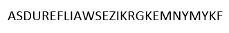
Here I have a text string. See if you can find a word that begins with D as quickly as you can:
I've slightly modified the text string; try it now.
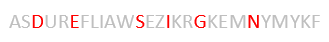
It's easier to see the word now, isn't it right?
The example I've given makes use of the colour attribute.
The preattentive attributes are categorised into four groups:
- Form
- Colour
- Spatial Position
- Motion
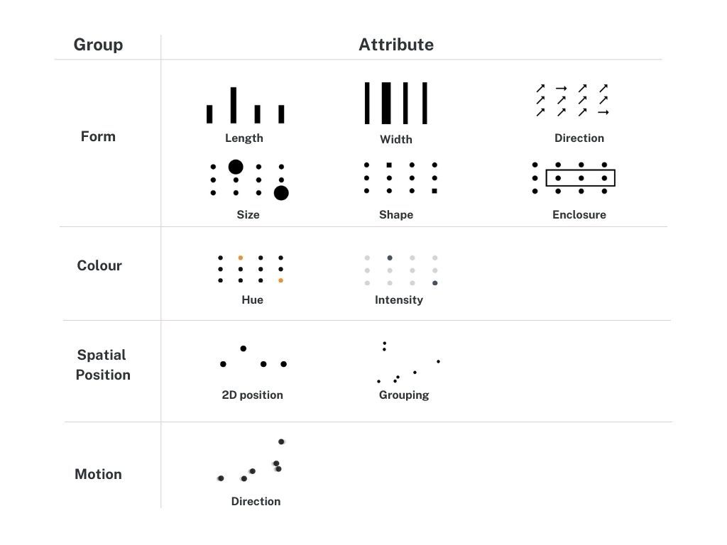
Form
The form category has the most attributes. What you see in the image above isnt the full list of attributes.
Here is an example of the form in action. We can manipulate the size of an object to indicate its importance in a data set, like what I've done. I have used size to show sales of all the products in the Technology sector of Tableau's Superstore data set.
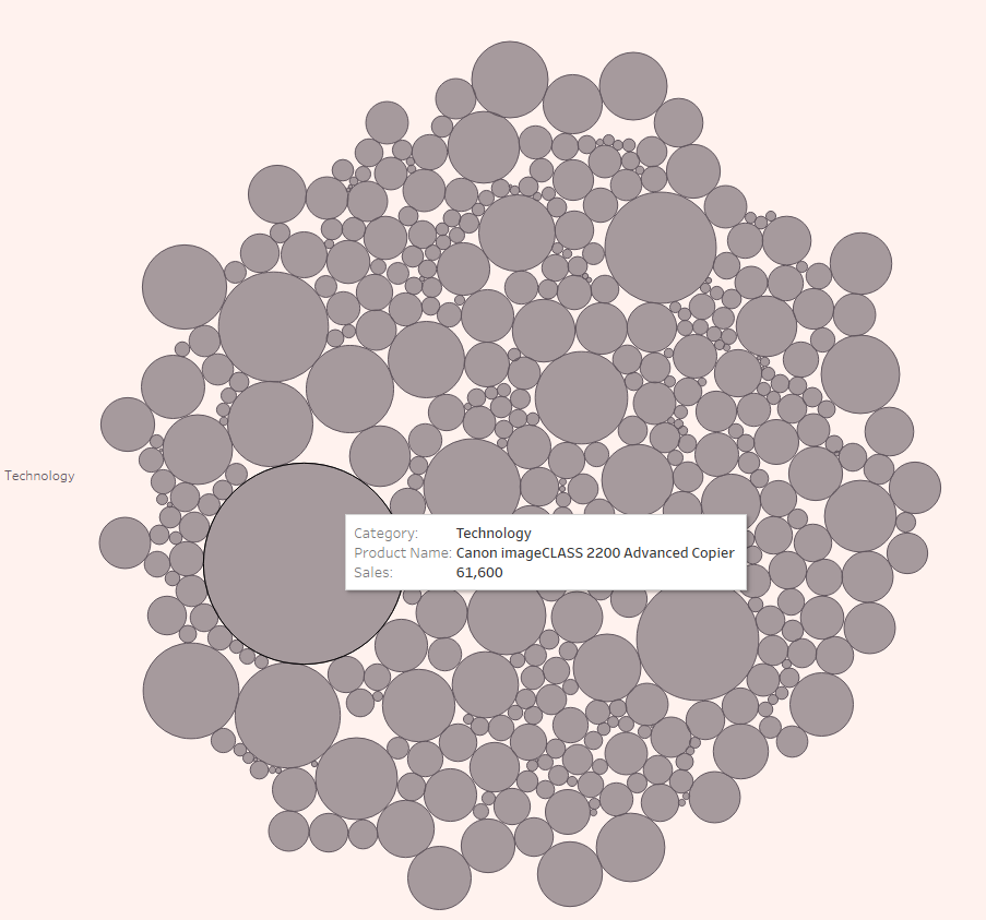
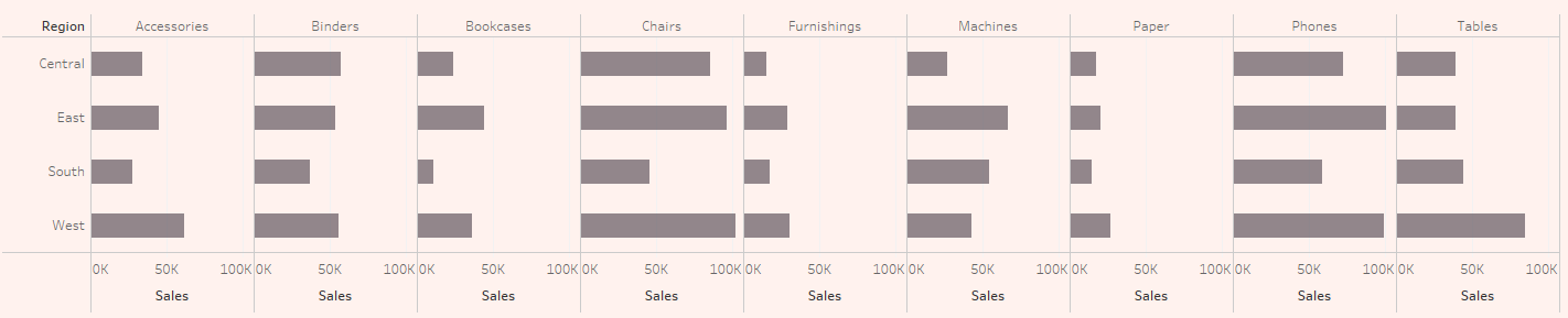
Our brain isn't great at precisely comparing the varying sizes of the data points, but it's sufficient if our goal is just for an approximate. If we want a higher degree of precision when comparing data, then we should leverage the length attribute, like what I've done in the chart below.
Here we are looking at sales revenues by region. Using a bar graph, we can easily see which region is doing well in sales by subcategory of products.
Colour
The colour category is probably the most important group. I won't cover much here. Please check out my blog on How to Choose Colours for Data Visualisation for detail.
To enrich the bar graph on sales by region (just above) with an additional layer of information, we could use variations in colour intensity to add profits to the visual.
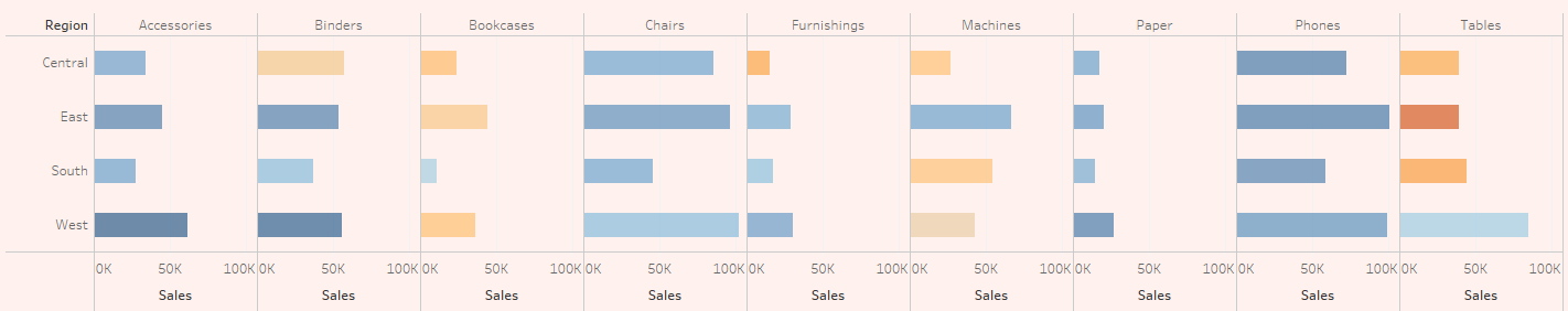
With colour, be sure to strike the right balance. If we overuse it, we lose the ability to focus the viewers' attention where we need it to be. If we underuse it, we lose the ability to direct the viewers' attention.
Spatial Position
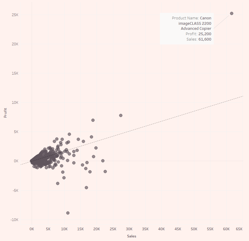
Often seen in the form of a scatter plot. It refers to the perception of two or more objects' position in space relative to each other.
In the scatterplot below, we can easily see that there is an outlier. The Canon Advanced Copier is the most profitable and has the highest sales.
Motion
Motion can be very effective in drawing attention; however, you should take care when using motion. Motion can become annoying or distracting rapidly.
Each attribute comes in handy for one or more information visualisation purposes. Now that you know about the preattentive attributes take advantage of it next time you create a visualisation to communicate your analysis. Use it to help your viewers to process information much faster and highlight the information you want to convey.