How to Choose Colours for Data Visualisation?


I spent the week painting and learning how to paint at the National Art School (NAS). For those who are interested, it is Australia's most important art institution. This year, the year 2022, the school marks the centenary of occupying the sandstone buildings of the former Darlinghurst Gaol. The site is steeped in history and infused with an artistic vibe. If you're looking for inspiration or art fun, check out NAS and their Gallery. NAS Gallery presents up to four major exhibitions per year. They also host annual graduate and postgraduate student exhibitions.
Continuing the theme week of art, I thought what better topic to write about than colour.
Colour plays a vital role in creating effective charts. It is one of the several preattentive attributes. Preattentive attributes are things that we notice without using conscious effort to do so.
Colour should be used purposefully. When colour is used correctly, it can enhance the story you want the data to tell. While done poorly will hide or distract from a visualisation's purpose.
This blog post will provide an overview of colour theory and the types of colour palettes used in data visualisation. I'll also offer some general tips on working with colour and conclude with a few suggested colour tools to help with data visualisation.
Colour Theory
Colour theory is a set of rules and guidelines that artists and designers use to create good-looking or harmonious colour combinations.
The colour wheel is at the heart of the colour theory. It was created in the late 17th century by Sir Isaac Newton.
I've located two excellent infographics that will give you a good overview of colour theory and the jargon used.
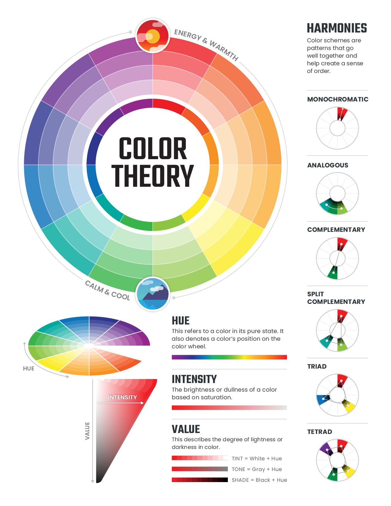
This one is on the basic definitions and key concepts from Pavilion DINFOS:
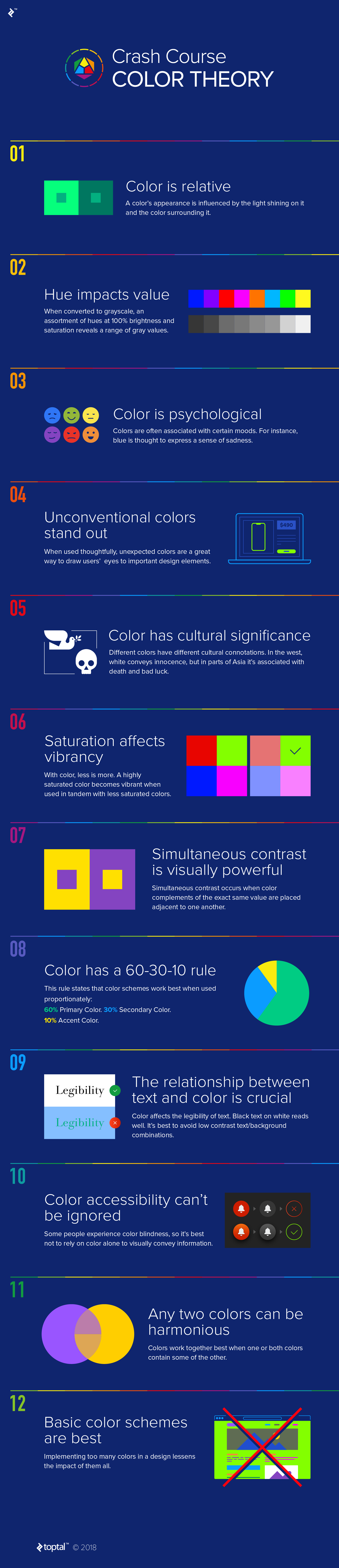
This one is a guide for quick colour choices from Toptal:
Types of Colour Palettes
There are three types of colour palettes used in data visualisation: Sequential, Diverging, and Categorical.
Sequential
The colour is ordered from low to high gradient. Lighter colours represent lower values, and darker colours represent higher values.
Dos & Don'ts
- Do Use monochromatic palettes to show sequential relationships.
- Do Use this palette type for quantitative and ordinal data. Quantitative data refers to numbers, and they can be measured and aggregated. E.g. profits, sales. Ordinal data refers to data with clear order, e.g. grades, age
- Don't use this for categorical data. It can cause confusion and misinterpretation.
Diverging
This palette combines two different sequential colour gradients with a neutral midpoint. Each end of this colour palette is the darkest value and the highest contrast of each colour. E.g. profits- negative vs positive, weather- blue for cooler temp, red for warmer temperature.
Dos & Donts
- Do use this for data with opposite extremes, diverging from a central point.
- Do use gradients of complementary colours.
- Don't use a diverging palette for sequential data. It can cause confusion and misinterpretation.
Categorical
This palette uses different colours to distinguish between different categories. E.g. apparel categories like shoes, socks, vehicle types, office supplies etc.
Dos & Don'ts
- Do use colours that contrast each other and that have equal saturation.
- Do consider using complementary colours
- Don't use for data that is sequenced or ordinal
- Don't use monochromatic colours or colours lacking sufficient contrast as this can confuse and lead the viewers to think the data is sequential.
General Tips
Avoid Unnecessary Usage of Colours
While colour plays an essential role in data visualisation, it is wise to exercise restraint and use colour purposeful. Not every chart will require multiple hues. The power of colour is lost if too many are used.
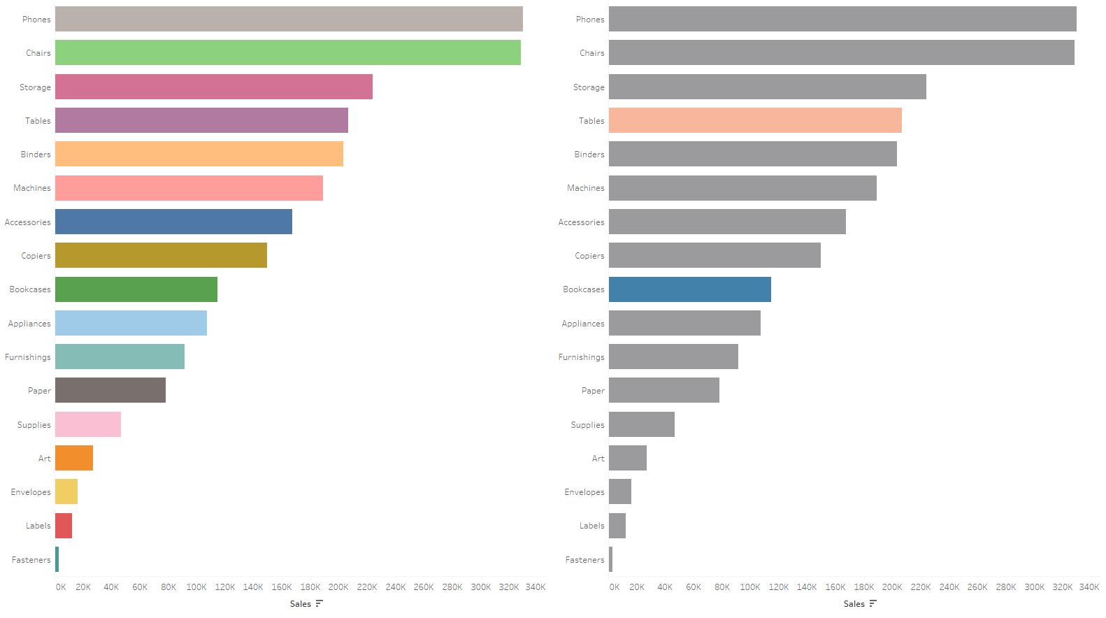
Consider the two bar charts of Tableau Superstore data below. On the left, we have a rainbow of colours- which makes the colour meaningless. On the right, we have two colours highlighted in neutral grey. This highlights the comparison of the two coloured bars.
Be Consistent with Colour Use
When preparing a dashboard or report with multiple charts, it is wise to keep the colour consistent between charts when they refer to the same category or entity. For example, if I'm visualising apparel data, I would keep all the socks, pants, and dress the same colour across the charts; this makes it easier for the viewer to understand the charts.
Leverage Colour Meanings
You can use how colours are perceived to enhance your visualisations' effectiveness. For instance, red is often used to alert or warn the reader. However, it's worth bearing in mind that the meaning of each colour can vary across different cultures. Red is a classic example. In Western culture, it is associated with danger or passion, whereas in the orient, it is associated with luck and prosperity.
Consider Accessibility to Colour Vision Deficient Viewers
According to a research (Worldwide prevalence of red-green colour deficiency, Birch 2012), Caucasian men have a red-green colour deficiency, compared to 0.4% in Women.
Colour Vision Deficiency (CVD) is mostly hereditary. From the prevalence quoted, it is apparent that it primarily afflicts men.
There are three types of CVD. It is caused by a lack of one of three types of cones within the eye to see colours. The three types are:
- Protanopia-lack of long-wave cones, weak red.
- Deuteranopia- lack of medium-wave cones, weak green.
- Tritanopia- lack of short-wave cones, weak blue. Extremely rare.
Red-green CVD is the most common, so avoiding using red and green together is best. In general, avoid using traffic light colours. The blue and orange palette is a good substitute that is colour-blind friendly, blue for good and orange for bad. Another helpful thing is to add visual indicators in your data other than colour.
Colour Tools
Color Brewer
Create colour schemes for map data visualisation
Viz-Palette
Check your palettes before you put together your visualisation. It allows you to view your colour sets in the context of example plots.
Data Color Picker
Generate sequential and diverging palettes.
Colbis
Simulate colour blindness to check the accessibility of your colour palette.
Color Tool for Tableau
Create custom colour palettes for Tableau without the hassle. With this tool, you can pick the colours you want in your palette, and the tool will put together and generate the XML code to include in Tableau.
You can also do a colour match from an image or use the tool to autogenerate complementary colours to go with one colour of your choice.
Wow, that's a lot of information on colour in data visualisation. I hope you find it helpful. Remember to let your data set determine the type of colour palette. Use colour purposely and not haphazardly. It's powerful when used correctly. Lastly, next time you're creating a dashboard or report, play around with the tools suggested above.