Why Do We Visualise Data, and Why is it Important?


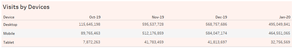
Here I have a table of fictitious data of visits to a website broken down by visitors' devices. If I ask you to describe what you see in the data, such as which device is the most popular? Describe the device usage trend over time; you'll agree with me that it's hard to tell, right?
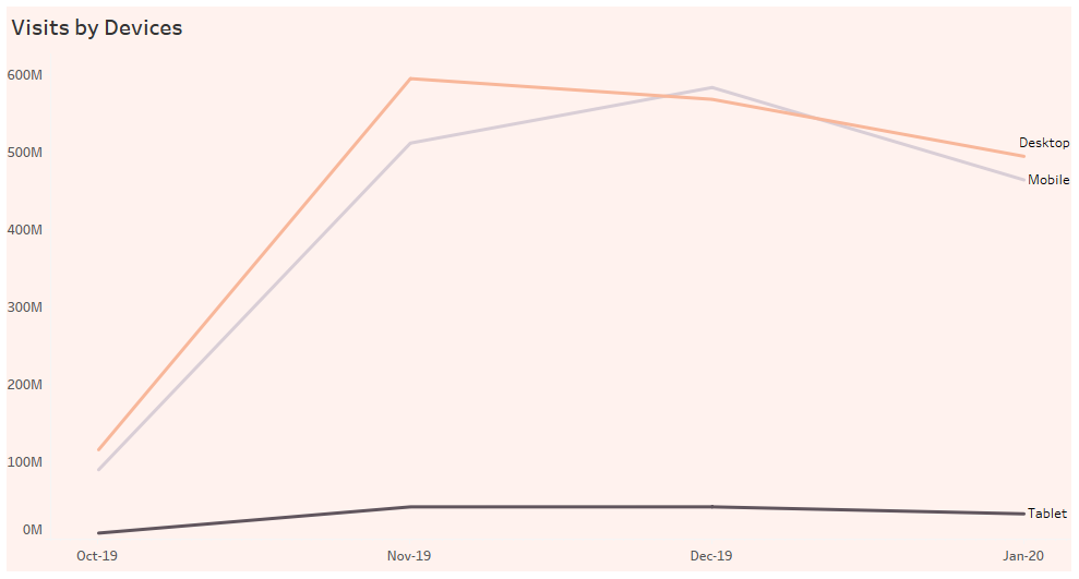
Below is the same data visualised in a line chart. We can now see that most visits are done on desktop and mobile. From Oct 2019 to Nov 2019, there was an accelerated number of desktop and mobile device visits.
While a table is excellent at showing precise numbers, it is difficult for our brains to make sense of it. What I have shown is a small data set. Imagine trying to make sense of a table with thousands and millions of data points- we would be completely overwhelmed!
We live in a time where the amount of data is growing exponentially. According to the World Economic Forum, it is estimated that the world produces 2.5 quintillion bytes of data daily (that's 2.5 followed by a staggering 18 zeros!), and 90% of all data has been created in the last two years. These stats were reported in 2017. That was five years ago; I'm having a hard time fathoming the current data production rate, are you?
If the number I've quoted above sounds gibberish to you, this infographic by Adeptia might help put things in perspective.
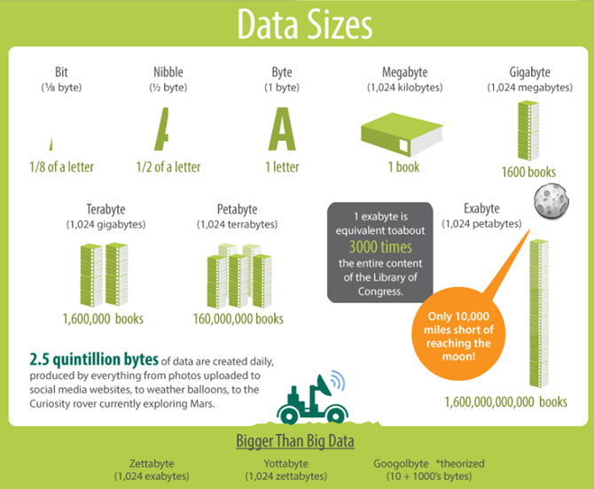
1 quintillion bytes is 1 exabyte, so 2.5 quintillion bytes is 2.5 x 1,600,000,000,000 books, which equals 4,000,000,000,000 books!!!
Using my simple example of the Views by Device dataset, we established that our brain is ill-equipped to devour raw numbers and see patterns and insights. In a world of growing data, data visualisation has become increasingly essential.
Visualisation enables companies to make faster decisions as it aids in understanding and consuming vast quantities of data. With visualisation, you can easily spot correlations in relationships of independent variables, such as time spent running vs body fat. Visualisation also lets you see trends over time and help you make predictions. It's also great for showing differences or similarities between values.
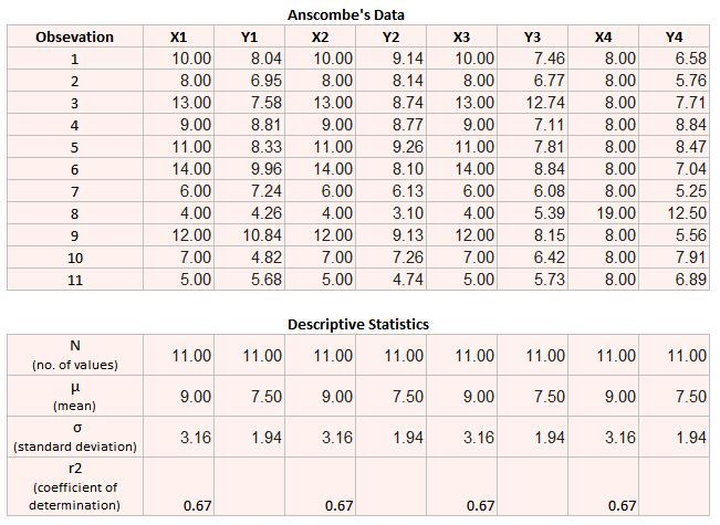
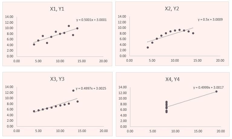
Furthermore, it can provide insight that traditional descriptive statics cannot. A great example is the famous Anscombe's Quartet, constructed by statistician Francis Anscombe in 1973. Anscombe's quartet refers to a group of four data sets with nearly identical descriptive statistics. However, they have very different distributions and appear very different when graphed. This demonstrates that nuances in data, such as outliers, dispersion of data etc., can't be surfaced without visualisation.
I hope you now understand the value of data visualisation. We need graphs and charts to communicate data findings and make sense of data. It is vital for gaining insights and enabling companies to make better and faster decisions.