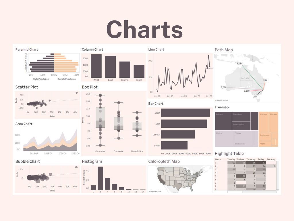
Types of Charts and Their Uses

Henry Hubbard, known for modernizing the periodic table created by the Russian chemist Dmitri Mendeleev said, "There is magic in graphs. The profile of a curve reveals in a flash a whole situation – the life history of an epidemic, a panic, or an era of prosperity. The curve informs the mind, awakens the imagination, convinces."
With this opening quote, I'm sure it is apparent to you that this blog is all about types of charts. There are many ways to visualize data. This list I have here is not exhaustive. I aim to provide an overview of some common charts and their application.
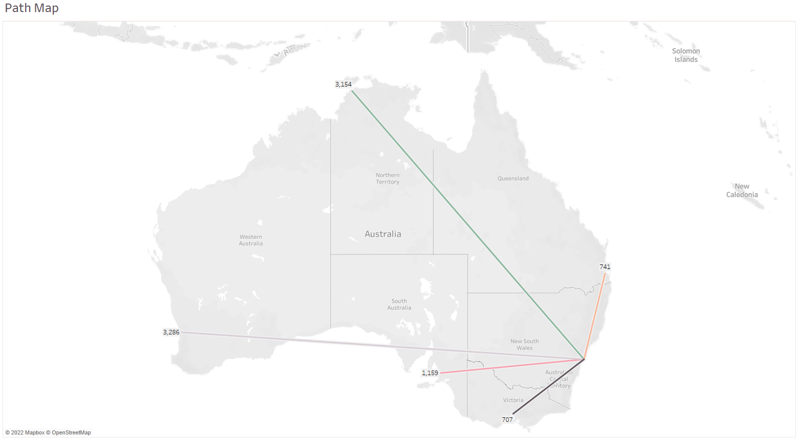
The charts you see below are all created in Tableau. I used four datasets: Tableau's US Sample Store, Tableau's Population, fictitious email delivered dataset, and path dataset adapted from a course I took with MIP- The Data Company.
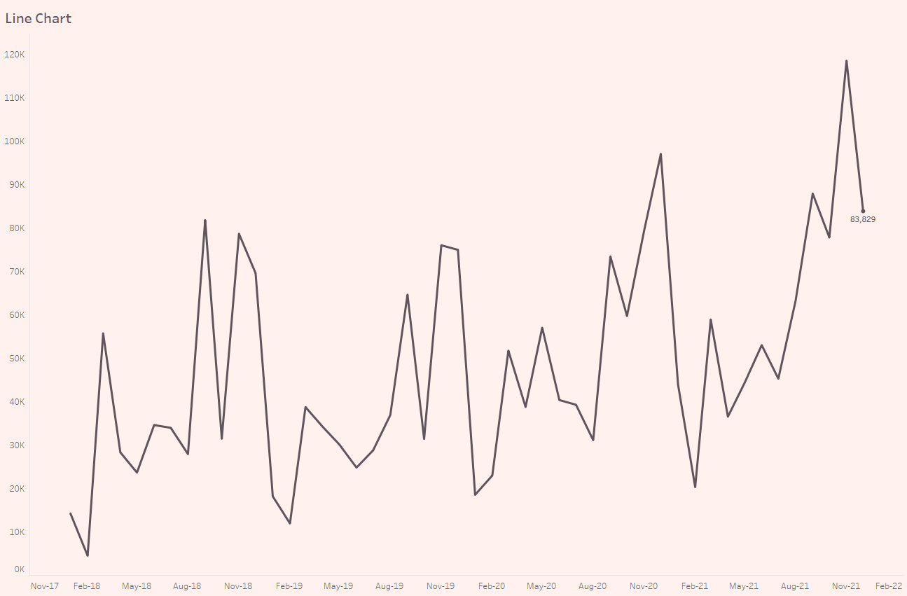
Line Chart
The line chart or line graph is one of the most used visualizations. It links several data points and shows a change in one or more variables over time. As such, this chart is great for showing changes over time, like sales over months.
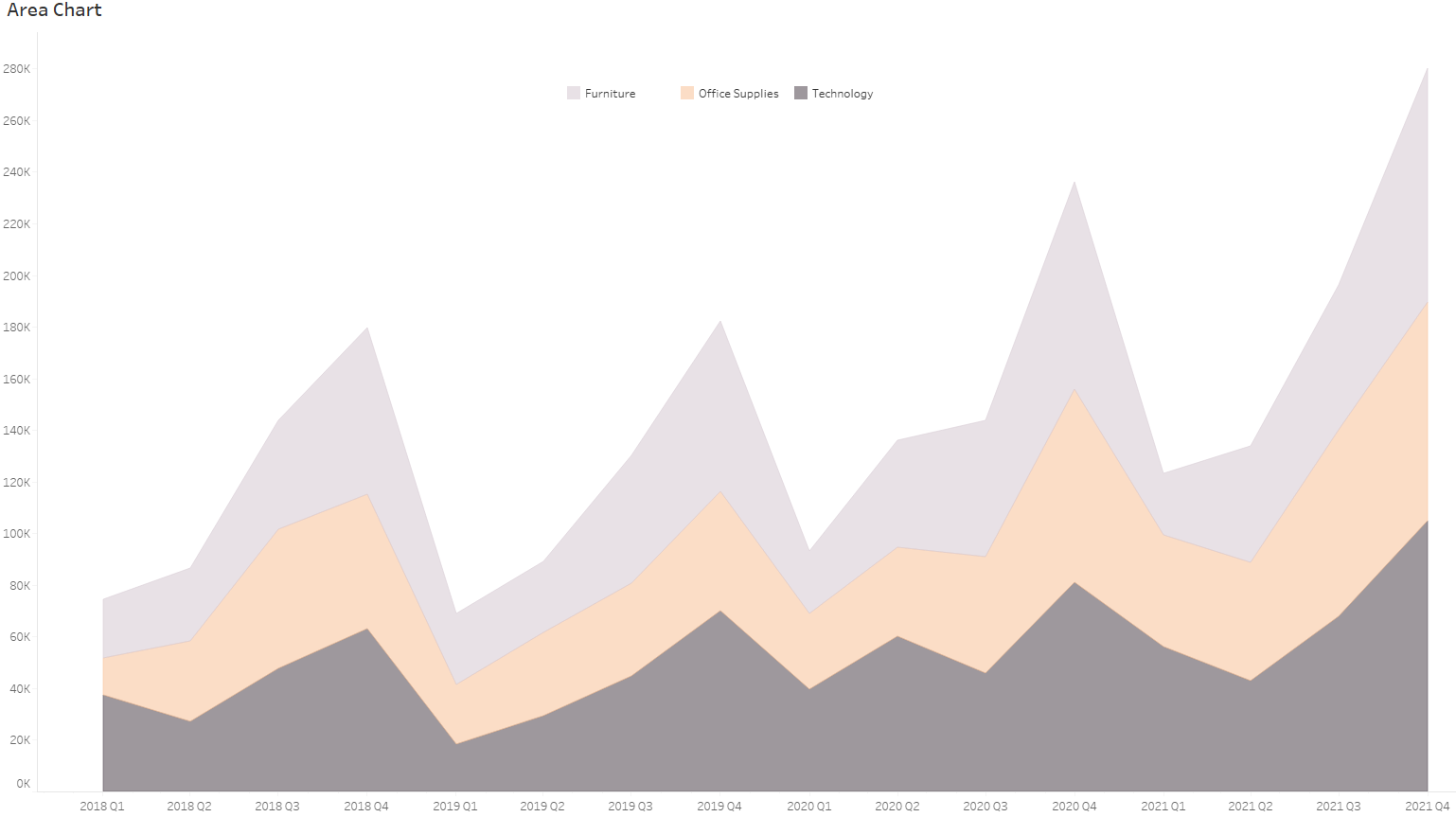
Area Chart
An area chart is based on the line chart. The area under the line is filled in. This type of chart shows cumulative changes in multiple variables over time. This chart is good at showing changes to the total.
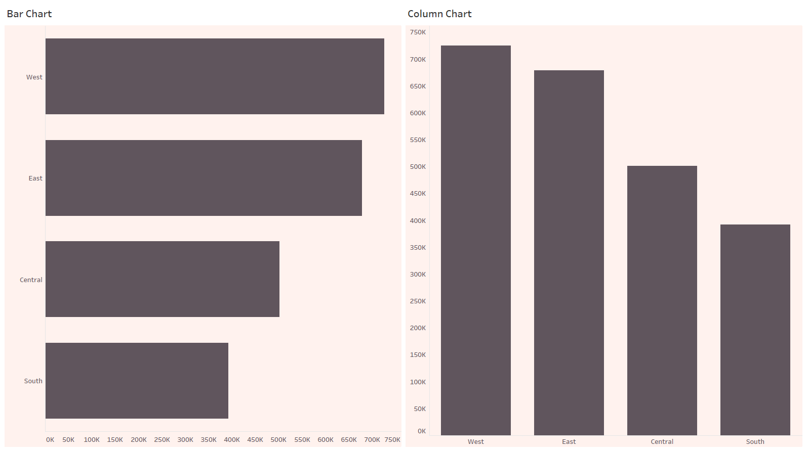
Bar Chart
A bar chart is another one of the most common data visualizations. It is excellent for comparing data across categories, highlighting differences, see trends at a glance. A nice touch is to sort the bar in order, making it easier for the viewer to digest the information.
Column Chart
The column chart is a bar chart flipped vertically. So not surprisingly, it's great for comparing data. It takes advantage of the height of the column to reflect the difference in the data.
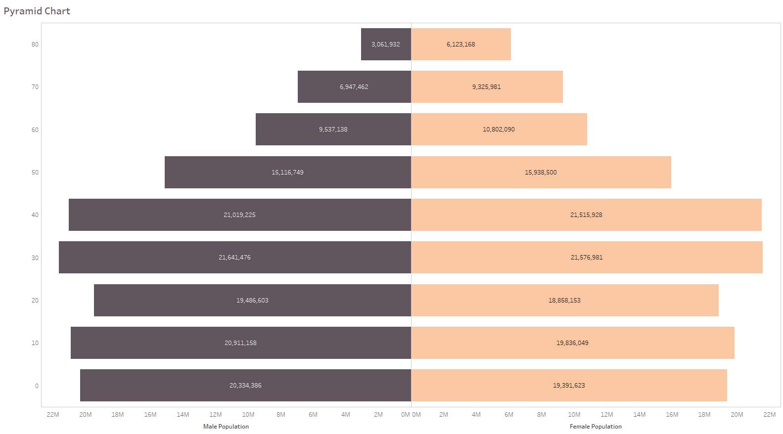
Population Pyramid
A population pyramid is a form of a bar chart. It is useful when you want to show ranking with population distribution.
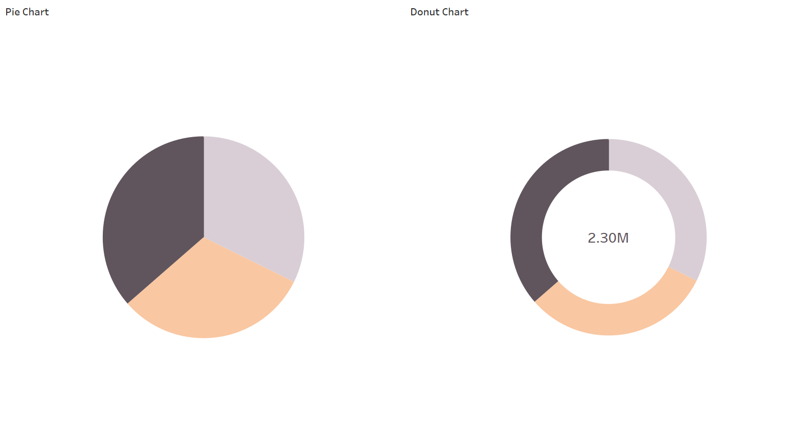
Pie Chart
It is a chart that uses slices to show parts to a whole in the form of a pie. It is recommended that a pie chart should not have too many slices. It becomes too difficult to read if you have too many slices; consider an alternative if you have too many. I generally stick to 3-5 slices. A pie chart with two slices is a bit of an overkill. I recommend that you annotate the pie slices with % contribution. Our brain isn't as well equipped to compare areas compared to heights.
Donut Chart
The donut chart is a pie chart with the centre cut out. I much prefer a donut chart over a pie chart. I think it's heaps more stylish. The donut centre can be used to include more information about the data. The donut chart is very popular for fitness tracking. It's also great to show % of the plan.
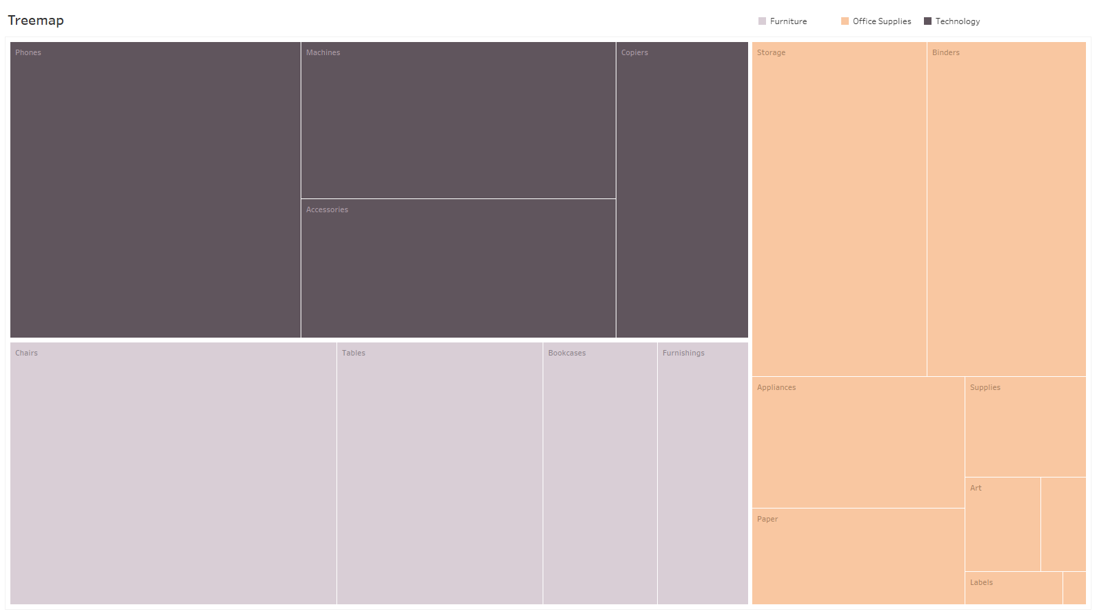
Treemap
Treemap is a way to visualize hierarchal data in a nested format. Each rectangle in a treemap is subdivided into smaller branches based on its proportion to the whole. It is useful when you compare parts of a whole and have many categories. However, reading can be challenging when there are many small segments.
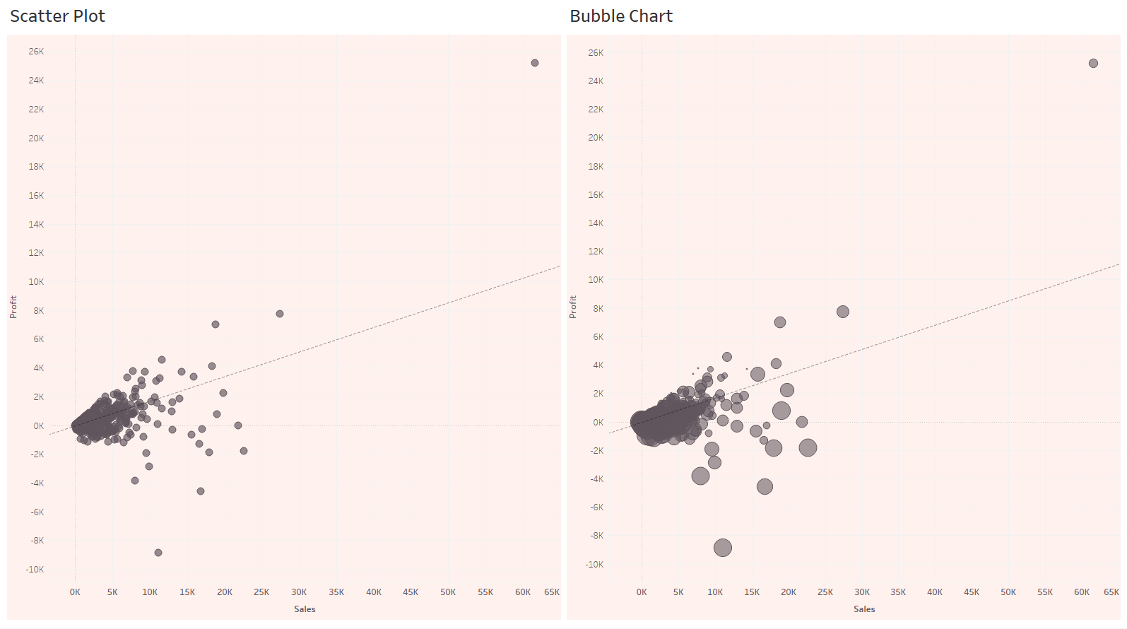
Scatter Plot
Scatter Plot is a graph with plotted points showing the relationship between two sets of variables. It's effective for showing if one variable is a good predictor of another or if they tend to change independently.
Bubble Chart
A bubble chart is like a scatter plot but with one additional dimension. You use this chart when you have three variables to compare. Changing the size and colour of circles creates visually compelling charts presenting large volumes of data simultaneously.
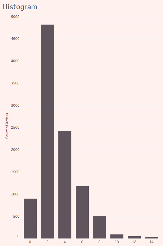
Histogram
A histogram has a similar appearance to a column chart. However, histogram groups the number of times an event occurs within a given data set into ranges called bins. You use this chart to show frequency distribution.
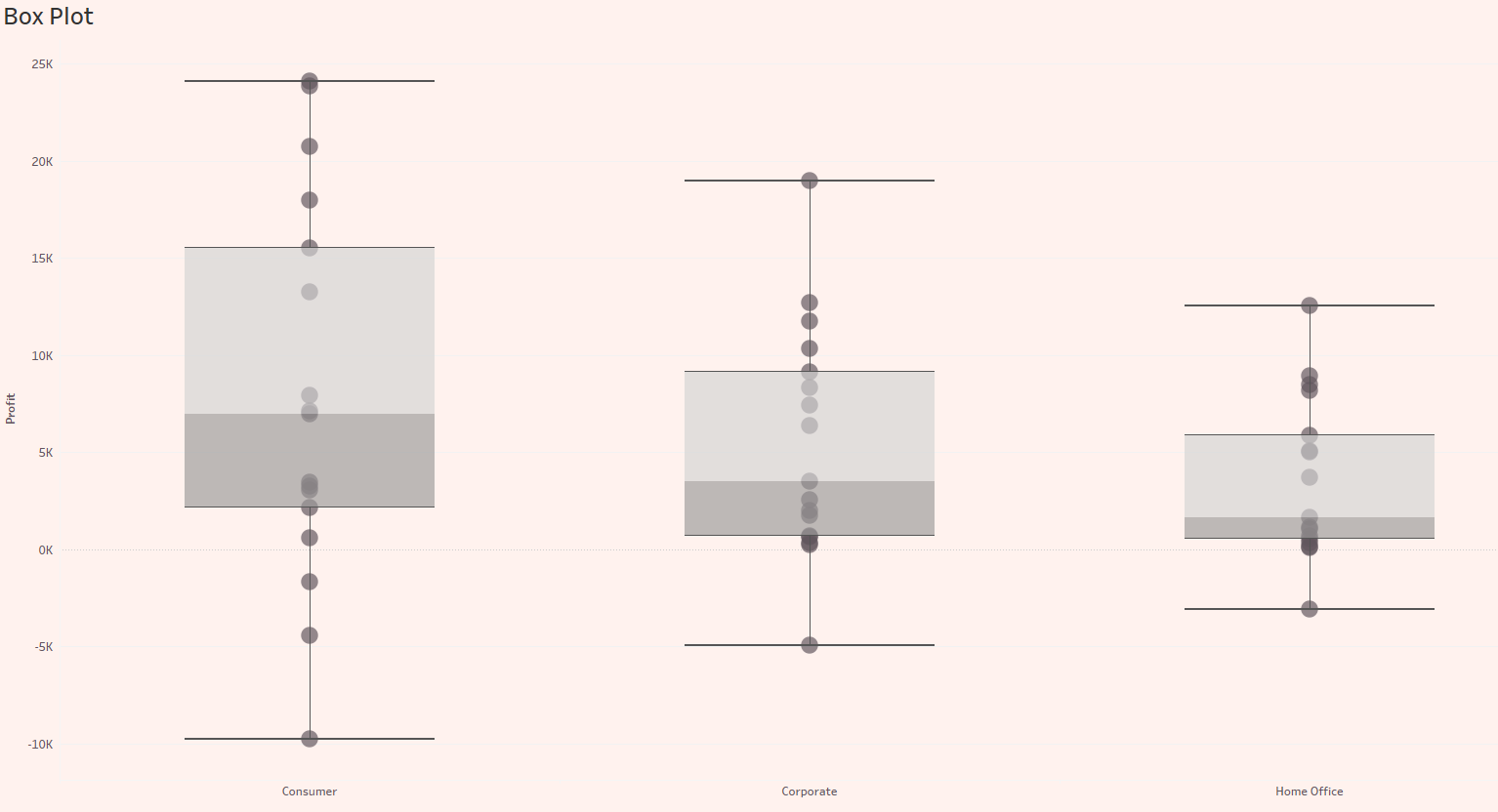
Box Plot
Box plot visually shows numerical data dispersion and skewness through quartiles and median. The box represents the second and third quartile (50%) of data points. The line within the box is the median. The two lines extending outside the box are called whiskers and represent the first and fourth quartile. Hence, a box plot is also known as a box and whisker plot.
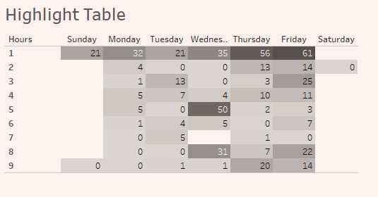
Highlight Table
A highlight table is a text table enhanced using colour to show high, low and in-between values. The different shades allow users to discern the extremes quickly.
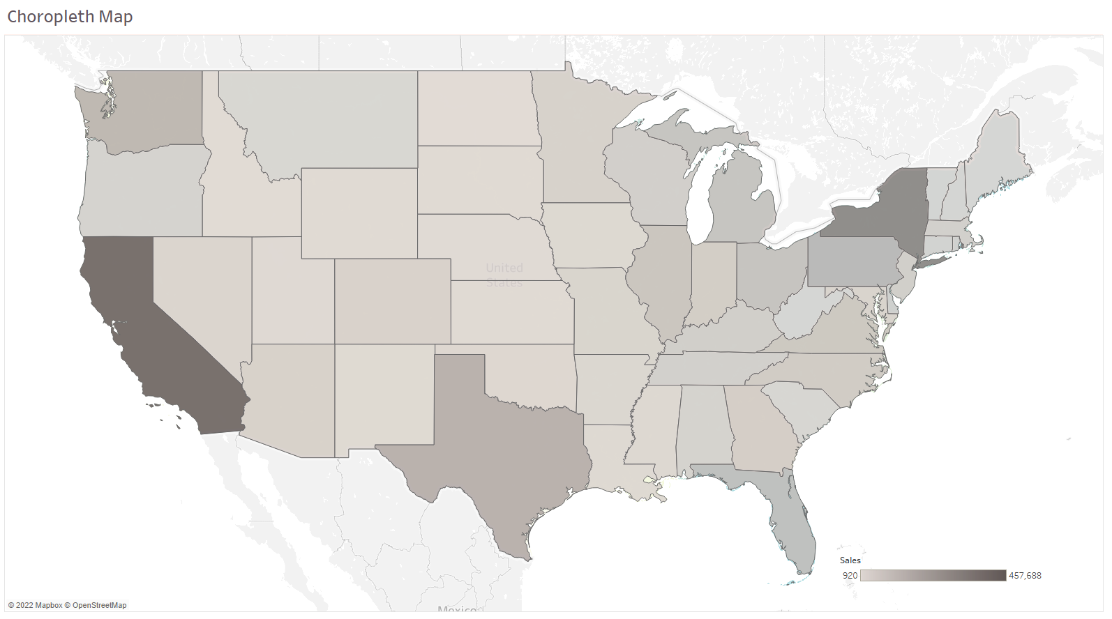
Choropleth Map
A Choropleth map is a map that is shaded according to the magnitude of an attribute. In the map below, the attribute is sales volume. A choropleth map is helpful to compare a dataset by geographic region.
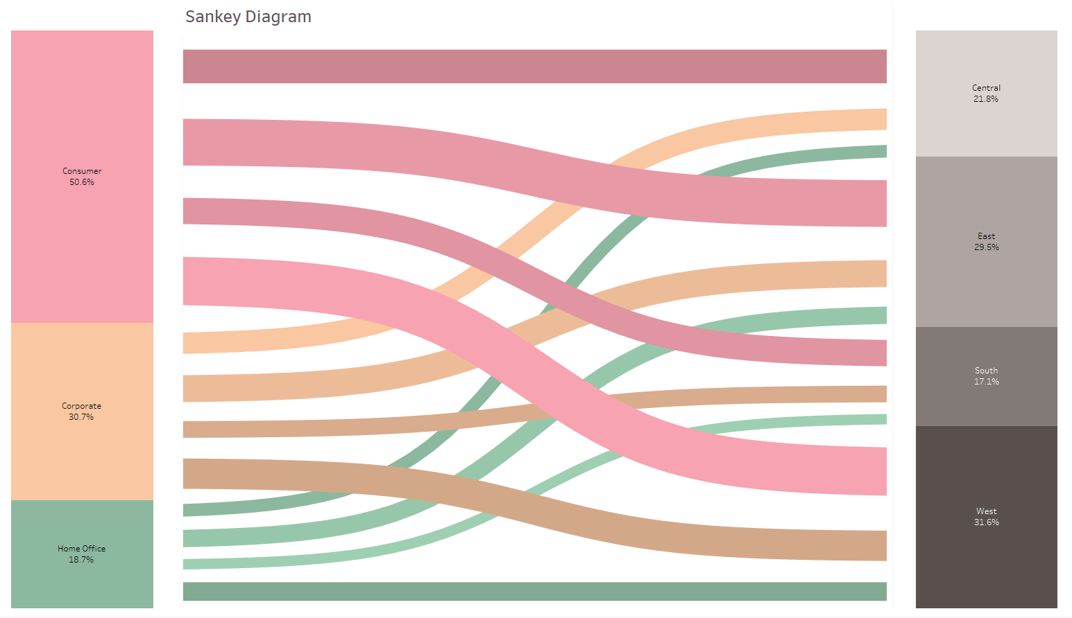
Sankey Diagram
A Sankey diagram is a visualization that displays the movement of data from one set to another. The width of the band is proportional to the quantity of the flow.
Network Diagram
A network diagram displays relationships between entities. It shows how each entity is connected to the others to form a network.
There are many more graphs I've not covered here, but I've covered all the basic charts that many consider simple and dull, like line and bar charts. However, don't underestimate them. It is worth noting that while these charts aren't nifty like Sankey, they are compelling. These simple charts are easy for people to understand.