Overview of Common Time Series Forecast Error Metrics


Thinking about forecast accuracy is a lot like self-reflection to me. Honestly, when it comes to forecasting, we hardly ever take the time to look back and see how accurate our predictions were. I can think of a few reasons why this isn't something people commonly do. The main ones that come to mind are time constraints, lack of awareness or skills, and the fear of being proven wrong.
Back in the day, I never really gave much thought to self-reflection. Even though I often felt dissatisfied with life, I avoided looking inward. I was scared. I didn't want to dig up difficult memories, deal with unresolved emotions, face guilt or confront my weaknesses. So instead, I chose to ignore or push away those things as a way to protect myself. But little did I know back then how much self-reflection could benefit personal growth and well-being.
Similarly, when reviewing our forecasts' accuracy, we often neglect this crucial step. We may be caught up in the busyness of our work lives, contending with a million other things that need our attention. However, just like self-reflection, taking the time to look back and assess the accuracy of our forecasts can be immensely valuable.
By reviewing our forecast accuracy, we gain insights into our strengths and weaknesses in forecasting. We can identify patterns of error, understand the factors that contributed to inaccuracies, and learn from our mistakes. This process allows us to refine our forecasting techniques, improve our models, and make more informed decisions in the future.
Furthermore, reviewing forecast accuracy fosters a culture of accountability and continuous improvement. It encourages us to challenge our assumptions, question our methods, and strive for greater precision. It pushes us to confront the fear of being proven wrong and embrace the opportunity for growth.
With that said, in this blog, I would like to:
- provide an overview of a few of the most used time series forecast error metrics
- show how these metrics are calculated
- explain the advantages and disadvantages of these metrics
Before we start, we need to bear in mind that there is no single best error metric; this is because when we use statistical measures, we take a lot of data and condense it into a single value. As a result, this only shows us a single aspect of the errors in the model's performance (Chai and Draxler 2014).
Therefore, adopting a more practical and realistic perspective and utilising a set of metrics that align with your specific use case or project is advisable.
We will look at the following four forecasting error metrics:
- Mean Absolute Error (MAE)
- Mean Squared Error (MSE)
- Root Mean Square Error (RMSE)
- Mean Absolute Percentage Error (MAPE)
I want to point out that these error metrics are not exclusive to time series forecasting. But instead, they are broadly applicable to any statistical or machine learning models where predictions are made.
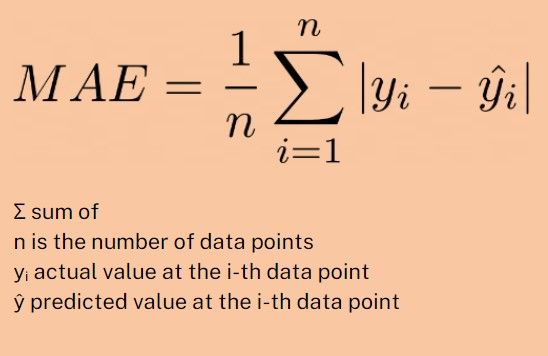
Mean Absolute Error (MAE)
MAE is the average of the absolute differences between the forecasted and actual values. Let me explain this with an example. Let's play guess the jellybeans in a jar game.
The MAE measures how close each of our guesses is by telling us how "off" our guesses were on average. To calculate it, we take each guess and subtract the actual number of jellybeans, which gives us the error of each guess.
Some errors will be positive (if we overestimated), and some will be negative (if we underestimated), but we only care about the size of the error, not its direction, so we take the absolute value. Then, we calculate the average of these absolute errors.
Here is the formula:
MAE Advantages:
Simplicity: It's pretty straightforward to understand. It's just the average amount we're off by in our predictions.
Equal weight to all errors: Every error contributes proportionally to the total. So, if we're off by 2, it counts twice as much as if we're off by 1.
MAE Disadvantages:
No distinction between overestimates and underestimates: MAE doesn't differentiate whether we overestimated or underestimated the count. It treats both equally.
Less sensitive to large errors: MAE doesn't emphasise large errors. So, if we're generally quite accurate but make one wildly off guess, that won't affect the MAE as much as it would some other error measures like the Mean Squared Error (MSE).
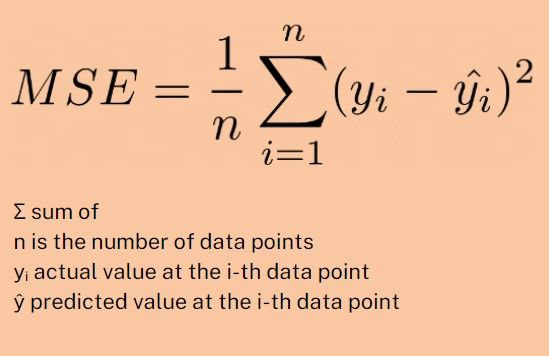
Means Square Error (MSE)
MSE is the average of the squares of the differences between the actual and forecasted values. Let's extend the jellybeans in a jar example.
Instead of just wanting the average size of our mistakes, this time, we want to be more penalised for big mistakes. This is where the MSE comes in.
To calculate the MSE, we do the following steps:
- Subtract the actual number of jellybeans from each guess to get the error.
- Then square each error (multiply it by itself). Squaring has a key effect: it makes all errors positive (since a negative number times a negative number gives a positive number) and makes larger errors count much more than smaller ones.
- Finally, take the average of these squared errors.
Here is the formula:
MSE Advantages
Penalises Larger Errors: If our guess is far off from the actual value, the squaring will make this error much larger, emphasising the fact that we were significantly wrong.
MSE Disadvantages
Sensitive to Outliers: Since larger errors are squared and thus amplified if our data has outliers or errors that are particularly large, the MSE will be heavily influenced by these values.
Harder to Interpret: Because the MSE squares the units of the data, the result isn't in the same units as the original data. For example, if we're predicting the number of jellybeans in a jar, our MSE might be in terms of "squared jellybeans," which doesn't make intuitive sense.
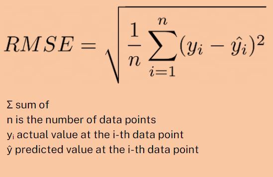
Root Mean Squared Error (RMSE)
RMSE is the square root of the MSE. Let's continue with the jellybeans example.
After calculating the MSE, we might find it tricky to interpret because it's in terms of "squared jellybeans," which doesn't make much sense. We would want to return it to the original jelly beans unit. To do this, we take the square root of the MSE to get the error back to the same units as the original data. So, if our RMSE is 10, our guesses typically deviate from the actual number of jellybeans by about 10.
Here is the formula:
RMSE Advantages
Penalises Larger Errors: Like MSE, the RMSE penalises larger errors, which can be useful if you want to ensure your predictions aren't wildly off.
Interpretability: RMSE is easier to interpret than MSE because it's in the same units as the original data.
RMSE Disadvantages
Sensitive to Outliers: Just like MSE, RMSE is sensitive to outliers because it squares the errors before taking the square root.
Greater Emphasis on Large Errors: While this can be a pro or a con depending on the situation, the RMSE, like the MSE, might not be the best metric if you want to treat all errors equally regardless of their size.
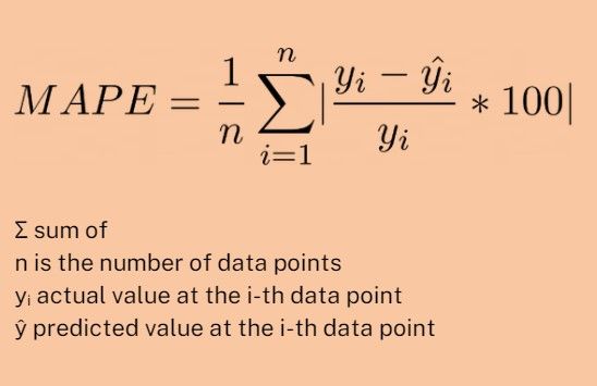
Mean Absolute Percentage Error (MAPE)
MAPE is the average of the absolute differences between the forecasted and actual values, expressed as a percentage of the actual values.
We are continuing with our Jellybeans example. Instead of just considering how much we're off by in the previous metrics, MAPE considers how much we're off by relative to the actual number of jellybeans.
To calculate MAPE, we take the absolute value of each error (just like with MAE), but then we divide each error by the actual number of jellybeans. This gives you the percentage error for each guess. We then calculate the average of these percentage errors to get the MAPE.
So, if our MAPE is 10%, that means our guesses are typically off by about 10% of the actual number of jellybeans.
Here is the formula:
MAPE Advantages
Easy to Understand: MAPE is expressed as a percentage, which is a universally understood measure. This makes it easier to communicate the accuracy of a forecast across different teams or stakeholders.
Scale-Independent: MAPE is a relative measure, meaning our data's scale does not influence it. Whether we're guessing the number of jellybeans or a city's population, a MAPE of 10% has the same interpretation.
MAPE Disadvantages
Infinite or Undefined Errors: If the actual value is zero, the percentage error is either infinite (if we overestimate) or undefined (if we underestimate).
Biased Toward Underestimates: Because MAPE is based on percentage errors, it can be more forgiving of underestimates than overestimates. For example, if the actual number is 100, an underestimate of 50 is a 50% error, but an overestimate of 200 is a 100% error.
Not Suitable for Low-Value Data: If the actual values are often close to zero, the percentage errors can be very large and misleading, even for relatively small absolute errors.
There you have it, the four common forecasting error metrics. Taking the time to review the accuracy of our forecasts is an essential step for improving and refining forecasting techniques, which can enhance the quality of future predictions.